The new face of LuxDev
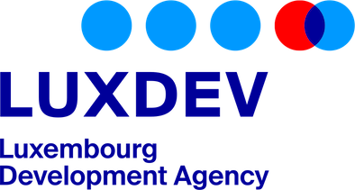
We are delighted to present the new logo of LuxDev, the Luxembourg Development Cooperation Agency.
Why change our logo?
While our vision, mission and values remain unchanged, we have decided to adopt a new visual identity.
To create it, LuxDev called on the Monogram agency, which helped design the Grand Duchy of Luxembourg's new visual identity.
Fully in line with the nation branding of the Luxembourg State, this logo reflects our dynamism, professionalism and expertise. Beyond these aspects, it symbolises our global presence and our spirit of partnership.

The symbolism of the new LuxDev logo
The composition of the LuxDev logo is no accident.
The dots
The blue dots represent our partners on the four continents of Africa, Asia, Latin America and Europe.
The red dot represents our Agency.
In the field, LuxDev's work consists of strengthening partner countries' ownership of their own development, i.e. developing their capacity to exercise real control over their own development policies and strategies. As a catalyst, it is essential that we support our partners in their efforts to bring about change, without taking their place, and by creating sustainable synergies with them through targeted actions. This approach is symbolised by the meeting of the red dot and the blue dot.
There are many ways of reading and interpreting this meeting:
- the red dot meets the blue dots and vice versa;
- the red and blue dots are superimposed to create something new in the centre;
- the red dot creates a dynamic to accelerate the movement and sustain the initial impetus of the blue dot.
Positioning the symbol
The choice of positioning for the logo symbol is not insignificant either.
Its offset from the letters LuxDev aligns the first dot with the ‘X’, which is the symbol of the Luxembourg Aid & Development logo. This positioning demonstrates our alignment with the policies and orientations of Luxembourg Cooperation.
The dots extending to the right create a dynamic movement, illustrating the progress of development in our partner countries.
The text
The text below LuxDev is a clear indication of who we are: the Luxembourg Development Cooperation Agency.
The colours
Finally, red and blue refer to Luxembourg's national colours. They create a direct visual link between Luxembourg Cooperation and LuxDev. The navy blue of the text is a fusion of red and blue.
We sincerely hope that you like this new visual identity and remain at your disposal for any questions relating to its implementation via our contact form.
↑ To the top